
Objectives
This was a second-term project in my design formation program. The assignment required creating a visual identity for a BC-based organic food company and developing a brand system and packaging for premium pasta products that need to stand out in the natural foods market. A key requirement in the brief was to avoid Italian motifs and instead establish an authentic connection to British Columbia’s regional identity.
Rationale
For Pasta Peaks, I researched BC’s identity and food culture, developed a brand essence around community, sustainability, and freshness, and sketched logo concepts with mountain and agricultural imagery. After digital refinement, I selected colors reflecting BC’s natural environment and created a packaging system with horizon-line visuals and product-specific symbols. The final identity consistently communicated the brand’s regional roots and organic values across all touchpoints.

Process
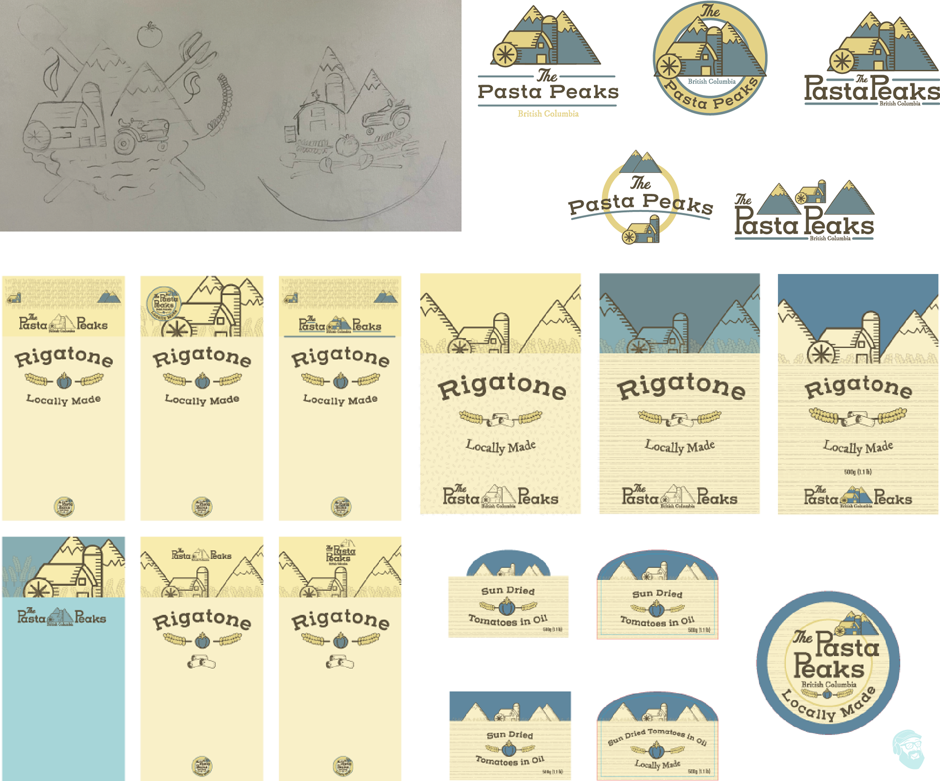
Brand Standards
